Big companies didn't get to the top of the tree by luck alone. To become successful, businesses have to blend great products with brilliant promotional techniques. Sometimes, those promotional techniques involve a little more than what initially meets the eye. Specifically, a big company's logo isn't always just a logo!
By using subtle combinations of color and spacing, a well-designed company logo can work on several levels at once. What at first glance might look like nothing more than the company's name might actually contain a hint to what the business does, or a subliminal advert for their professional services.
In this list, we're going to look at fifty company logos that contain hidden images. Some of them belong to businesses you've known and have been interacting with your whole life. Once we've pointed them out, you'll wonder how you've never noticed them before - and now you'll never unsee them!
We all know what the FedEx logo looks like. We've seen it thousands of times. Is says 'fed' in orange, 'ex' in blue, and it's in a thick, bold type so you won't miss it. It's effective, but it seems a little bit boring. That's only until you notice the little extra detail the logo is keeping secret, though. Between the 'E' and the 'X' in the second half of the name, take a closer look at that white spacing. It's in the shape of an arrow.

There's no better basic image for what FedEx does than an arrow. Their whole job is to get things from one place to the other as efficiently as possible. Once you've noticed the arrow, it instantly and seamlessly becomes part of the logo. It's the company's way of telling you that anything you send with them gets from A to B quickly and precisely. As an extra trick, they've also managed to repeat the trick with the Arabic version of their logo - only this time the arrow is facing in the other direction because Arabic is read from right to left.
This one is something of a break from the norm. There was never originally supposed to be a hidden message within the world-famous logo of Cola Cola - it's just a nice, flowing handwriting logo, with a color scheme that's become iconic. Coca Cola doesn't have a monopoly on red and white though - they're also the colors of the national flag of Denmark. Just where the 'o' meets the 'l' of 'Cola,' the handwriting crosses over itself and appears to form a white cross against the red background, and so the Danes recognized their flag in it.

Coca Cola may not have intended to put the Danish flag there, but they're happy to make use of free publicity when it offers itself up. To celebrate their newly-found connection with a country that's frequently voted as the happiest on Earth, they sent teams to Copenhagen airport to welcome visitors with giant Coca-Cola themed flags which highlighted the area said to resemble the flag. Somewhat bafflingly, they didn't also provide the thirsty tourists with a bottle of Coca Cola, which would surely have made more sense.
How did we organize our lives before Pinterest? We're not sure we can even remember anymore, but it's definitely the only place we look when we're putting together recipes, or style ideas for big nights out. As the name suggests, the purpose of Pinterest as a website is for users to collect things together in the same place for safekeeping, like our parents used to do by pinning things to a board in the kitchen or hallway.

As Pinterest is all about 'pinning' things in place, it makes sense for the logo to incorporate a pin. The round head of the letter 'P,' drawn in a cursive style, is designed to make you think of a pin. That's not all, though. The 'T' is apparently intended to look a little bit like a paperclip. We're less convinced about the 'T' than the 'P,' but it's perfectly on-theme regardless.
This one isn't particularly subtle, and yet to our surprise, there are people out there who've never noticed it before. Chick-Fil-A is one of those companies who've settled on a 'joined up handwriting' style of logo - of which we'll see plenty on this list - but they've added a little decorative twist to get you thinking about their product range every time you see their logo. From a psychology point of view, that could be the difference between you making a purchase, or deciding to pass.

The little twist we're referring to is the presence of those red dots above the 'C,' which combine with the design of the 'C' to remind you of the basic appearance of a chicken. The beak on the outside of the curve of the letter seals the deal. This isn't a subtle as some of the techniques we'll see in operation on this list, but it's effective.
You might have heard NBC referred to as 'The Peacock Network' before now. If you have, you've probably realized that the nickname is related to the broadcaster's colorful logo. But why did they choose one of the world's most colorful birds as a source of inspiration? The most obvious reason is that it stands out - you can always pick the NBC logo out among a crowd - but it's a little more sophisticated than that.

When NBC launched, it was split into six divisions. Each different shade of color on the peacock's feathers represents one of those divisions. The network has added several more divisions since it launched, so by rights the peacock's tail should be even more impressive than it is! Also note the position of the peacock's head, which is represented by the thin sliver of white in the middle of all the colors. It's looking to the right. We're apparently supposed to interpret that as the peacock (and therefore NBC) as looking forward into the future instead of back and into the past.
Companies don't come any bigger or more successful than Amazon. What started as a traditional mail order company has expanded to the point where it has its own subscription-based television network, and has made founded Jeff Bezos the richest man on the planet. All of this from a company whose logo initially seems to be as dull as it could possibly be - until you pay a little more attention to that arrow beneath the lettering.

Firstly, as we saw with the FedEx logo, the arrow is supposed to represent movement, or delivery. Secondly, the design of this particular arrow is meant to make the whole logo seem like it's smiling - and therefore give us the impression that Amazon is a happy, friendly company. Thirdly, note where the arrow starts and finishes - the letter 'a,' and the letter 'z.' That's because Amazon has everything you could ever want, from A to Z!
You don't really need to sell ice cream to us. You already had us at 'ice cream.' Not everyone is as easily sold on the cold, sweet stuff as we are, though, and so ice cream giant Baskin Robbins has a hidden reminder about how extensive their range of flavors is smack bang in the middle of their logo. There's a reason why half of the 'B' and half of the 'R' are picked out in pink instead of blue - it's so they make the number 31.

Why is 31 so important to Baskin Robbins? If you order from there regularly, you'll already know. Baskin Robbins offers 31 unique flavors of ice cream - one for every day of the month (except shorter months, but we'll let them have that). The logo is a reminder than there's always a new flavor for you to try!
Designing a logo for a sport can't be an easy job for a graphic designer. You have to get across the idea that the sport is dynamic and exciting, but do it using as simple and universally-understandable a method as possible. When it comes to motorsport competition Formula 1, you can see exactly what the designer has gone for. The red block which represents the '1' is blurred, to give the impression of speed and motion. That's not the tricky bit here, though.

The really clever part of the Formula 1 logo is, once again, in the white space between the black 'F' and the red '1.' Look closely, and you'll see that it represents the number '1', just to remind us all one more time that this is the most prestigious and widely-viewed motorsport in the world. If you're the world leader, it never hurts to remind people of that fact - and this logo does exactly that.
Nachos are delicious. Everybody knows that, and nobody questions it. Do you know what's better than nachos, though? Nachos with dips! Whether it's hot salsa, sour creme, guacamole or something else, all of us have a preferred nacho and dip combination. If you're in the business of selling nachos, your fastest route to a sale is reminding your audience how incredible the combination of nachos and dips can be - which is what Tostitos does with its logo.

Eagle-eyed nacho fans might have spotted this already, but if you look at the positioning of the two 'T's in the center of the word, they're enjoying a giant nacho between them. Below them, the dot of the 'I' is a huge bowl of (probably salsa) dip for the nacho to go in. When you see Tostitos, you think of nachos and dip - and now you know why!
The hidden message you'll find in the logo of NFL team the Atlanta Falcons isn't an especially subtle one, but it's worthy of mention simply because it's such an unusual stylistic choice for a sports team. You've probably noted before now that the image of a falcon below the text of the logo isn't just a bird-of-prey in flight; the shape of the bird (and the inventive use of one talon) makes the shape of the letter 'F.'

The 'F' is, of course, for 'Falcons.' When you take the shape and positioning of the image and the text together, it looks more like something you'd expect to find on the hood of a car than as the logo of a successful sports franchise. The Atlanta Falcon would make a great name for a car, too. Perhaps someone should look into it!
Years of scientific research has told us that humans reach well to anything that appears to have a face - and especially a smiling face. It's one of the reasons we're so fond of cats, even when cats often seem so indifferent about us! It's also the reason that the logo of thrift and donation store Goodwill is so ideally suited to its purpose.

Whenever we get involved with a charity - whether that's by donating to one or buying from one - we like to feel like we're going something good for the world around us. Goodwill helps to provide us with that feeling by featuring a logo that seems to smile at us. The effect is an optical illusion - it's just a close-up of part of the letter 'G,' but it reminds us to go into the store with a smile on our face, and a positive attitude.
They're not a name you'll encounter any more thanks to their acquisition by Oracle, but once upon a time, Sun Microsystems were every bit as big a deal in the world of computers as Apple and Microsoft. At one point, their Linux machines represented the only real competition in the market to the Microsoft Windows system. They lost the war in the end, but they made a good fight of it for a long time.
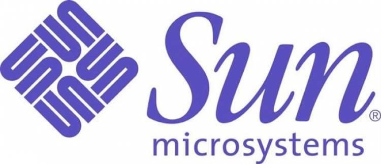
The Sun Microsystems logo looks a little dated by modern standards, which we'll forgive on the grounds that the company has been closed for almost a decade. Look at the diamond next to the text, though, and you'll notice that it's actually made up of the word 'Sun' running in every direction. Cleverly, each part of it could be interpreted as either a 'U' and an 'N' or an 'S' depending on your perspective. We guess they just really wanted to make sure that everybody knew their name!
As we mentioned earlier, logos for sports have to be exciting if they're going to draw in the public. The annual Tour de France isn't to everyone's tastes, but to its fans, it's the purest form of endurance racing in the world. It's also a huge global spectacle, drawing thousands of people to watch the race in person, and millions more who stay glued to the action on their television sets at home.

We're big fans of the jaunty, playful style with which the Tour de France logo has been drawn, but our admiration increased tenfold when we noticed the clever way they'd incorporated a cyclist and a bicycle into it. Look at the yellow dot next to the 'R,' and you'll note that the 'R' becomes a rider, gripping onto it. The 'O' and the 'U' then become the test of the bicycle, and the image is complete. It's beautifully done - but then we'd expect nothing less elegant from French art!
As with ice cream, we don't really need much in the way of a special incentive to eat or purchase Hershey's Kisses. We don't know if they're our favorite way of eating Hershey's chocolate, but they certainly belong in the conversation. The gentle touch of graphical trickery Hershey's have employed in the creation of the Hershey's Kisses logo isn't really a sales aid - it's more a reminder of what you're buying.

Take a long, hard look at the letter spacing around the word 'KISSES,' and you'll see that it's very slightly irregular. That's because Hershey's have played around with the 'K' and the 'I' just enough to slot in what looks like a Hershey's Kiss. It's the same size and shape as what you'll find inside the packet, and it's a neat way of incorporating it into the logo without being too obvious.
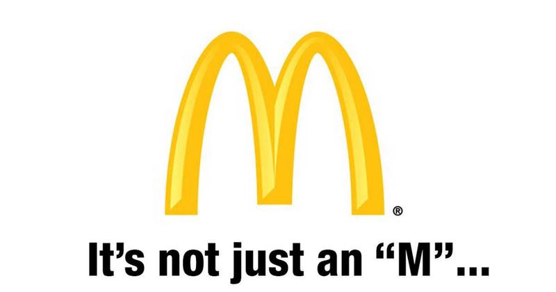
This is one we're really not sure about, but we're going to have to list it, because the person who designed the logo insists that it's part of the design. Everybody in the world recognizes the golden arches of McDonald's. You'll see it in almost every major settlement of humanity all over the world, and it means you're only moments away from a Big Mac or a double cheeseburger. The arches are supposed to look welcoming, but there's more to them than that.

According to Louis Cheskin, who worked for McDonald's as a brand consultant and psychologist during the 1960s, customers who look upon the big yellow 'M' will subconsciously recognize it - and this is a direct quote - as 'a pair of nourishing breasts.' Could that be true? Do any of us genuinely feel like McDonald's is a great source of nourishment? Can you even see what he's talking about when you look at the logo? We can't, but we'll take his word for it.
There's quite a lot going on with the logo of Sony's technology subsidiary company VAIO, but you'll only pick up on it if you know a thing or two about the digital world. Anybody who's worked in programming will pick up on the clues straight away, whereas to the rest of is it just looks like a cool and slightly futuristic font.

The wavy design of the 'V' and the 'A' is exactly what an analog signal looks like. The 'I' and the 'O' are a reference to binary - the machine code within which everything is either an 'I' or an 'O.' It's almost as if the whole name of the company is just an in-joke designed to appeal to tech geeks - and if it is, we don't mind at all! We still don't really know how to pronounce it, though. Our best guess would be that it's supposed to sound like 'vow.'
We have to reach back into the annals of history for this one. Regrettably for the people of Hartford, the Whalers are no longer with us. They belong to a bygone era of the NHL. We do still have their logo to remember them by, though, and it's a particularly lovely example of a hidden message done well.

The most prominent feature of the old logo is that the 'H' is picked out in gray right across the middle of it, but if you look down, you'll notice that the green area is the shape of a 'W.' As for the seemingly out of place area of blue which is positioned above the 'W'? That's the tail of a big blue whale, and gives the logo a healthy dose of playful character. We wish all sports teams were this good at thinking outside the box.
One of the most widely-known, most-famous logos in the world today? Apple. You might even be using a device made by Apple to read this list article right now. We all see the logo regularly - some of us even see it daily - and we all know who it belongs to. There's a really obvious question about it that very few of us ever think to ask, though - why does this famous apple have a bite taken out of it? Why isn't it just a complete apple?

The answer is a play on words which is so subtle and brilliant that we want to stand up and applaud it. The man who designed the logo, Rob Yanov, said he'd spent a week drawing apples and trying to come up with a clever twist on the idea when he took a bite out of one, and was struck by a revelation. The word 'bite' sounds exactly like 'byte,' as in the computing term. Therefore the 'byte' that's missing out of the Apple logo indicates that they work with computers. It's so simple, and yet virtually nobody knows about it!
Iconic logo design doesn't come much better than BMW. Having this badge attached to a motor vehicle is a sign of quality, and has been ever since the 1920s. The popularity of BMWs has never really wavered in the past century, and they're as desirable (and expensive) now as they always have been. That internationally famous blue and white logo isn't just there to look pretty though - it's telling us about the past of the company.

Blue and white are the colors of the flag of Bavaria. That's the region of Germany within which BMW was founded, and so represents their close ties with their homeland. The four sectors in the center of the logo, surrounded by a circle, are supposed to look like propeller blades. That's down to something that not many people know about BMW - in their early days the company was as interested in making planes as it was with cars. Their focus changed over the years, but their logo never has.
It would appear that some of the most innovative graphic designers of our age are doing their best work for zoos. We saw a fine entry from Pittsburgh Zoo earlier on, but we think the Bronx Zoo has them beaten hands-down. First off, we have the choice of giraffes to represent the zoo, and who doesn't like giraffes? Brown is always a risky choice for a logo, but in the context of a zoo, it works - it reminds us of earth, and nature.

The real triumph of this logo is what's going on between the legs of those giraffes. Within the white space, you'll find the outlines of many of New York's most iconic high-rise buildings. It's a great way to incorporate the local area into the logo design. It looks like it might be a bit pointy and uncomfortable for the giraffes, but sacrifices sometimes have to be made in the name of art.
Anything associated with rap legend Dr. Dre is bound to be cool by default, but he's really excelled himself with the headphones that bear his name. They've been around for a while now - and they're close to being the industry standard when it comes to quality - but that iconic logo looks as fresh today as it did on the day it was unveiled.

The key to this one is simplicity. What looks like a simple case of putting a 'b' inside a red circle is actually something far more detailed. Imagine the 'b' as one side of a pair of headphones, and the big red circle as a human head. Now look at it again, and you'll see it as someone wearing white headphones. That's exactly how it was designed, and now you know it's there you'll never see it any other way.
We defy anybody to provide a succinct summary of what Unilever's business model is. They seem to have a hand in absolutely everything. Even when you don't think you're buying from them, you'd be surprised how many brands you interact with every day are ultimately owned by Unilever. You probably buy dozens of their products every month without even noticing.

That spirit of eclectic products is beautifully captured by their distinctive blue logo. Most people who've never looked at it properly think it's a floral pattern, but it's not. Every single type of product Unilever makes is depicted somewhere within their logo. It all comes together perfectly in the shape of a letter 'U,' but it's a collage of everything they have to sell to you. Given the extent of the Unilever product range, that's no mean feat! How many different things can you identify now you know what you're looking at?
They say good things come in threes, and the logo of Northwest Airlines proves that. That 'W' next to the text is actually both an 'N' and a 'W' at the same time. The clever use of that white line as a divider means you can interpret it both ways. Because of that, we have an 'N' for 'north,' a 'W' for 'west,' or taken together, an 'NW' for 'north west.' That's design genius - and it doesn't stop there!

If we look at the logo as an 'N,' that leaves the little red tip which would otherwise be the top corner of the 'W' out on its own. When taken in isolation, it's actually an arrow, and guess which direction it's pointing in? You guessed it - north west. Someone gave this logo some serious consideration and thought, and we're more than happy to give them the praise they deserve for their innovation.
We're back with zoos again, and we've already decided that next time we need to have a logo designed for any purpose, we're going to go directly to someone who's just finished a project for a zoo. It's obviously where all the talent is hiding out. Great use of white space is what the Kolner Zoo logo is all about. A mighty elephant is a great choice to advertise a zoo with, but there's more here to enjoy than just the elephant.

If you're not a German native, you may not be aware that Kolner Zoo is in the city of Cologne. There's a little acknowledgment of that fact in the shape of the white points between the elephant's back legs - they represent the city's famous cathedral. We also have both a giraffe and a rhino hanging out within the elephant's silhouette. As for why the elephant is starry-eyed - we're afraid we have no idea, but we hope it doesn't mean that the zoo is only rated one star.
Toblerone is one of the world's truly great popular chocolate bars. There's just something about breaking the pieces of chocolate off into triangular shapes and eating them that makes the whole process fun. In recent years they've faced suggestions that the pieces are smaller than they used to be, but they aren't - it's just that your hands aren't a small as they were when you were a child, so they feel smaller.

If we look at the Toblerone logo, we can see a mountain to the left of the text. That's the Matterhorn, which dominates the skyline close to the place where Toblerone was founded. Gaze upon it a little more closely, though, and you'll notice the features of a bear hidden inside the mountain. We don't know why it's there, but it adds character. Maybe bears really like chocolate? We can't say we've even gotten close enough to one to find out!
We don't imagine you've come across the logo of the Guild of Food Writers too many times. It's an exclusive organization which can seem a little elitist, but if we're honest with ourselves, we all wish we did the same job as them. Who wouldn't want to make a living out of traveling to the world's greatest restaurants, getting paid to eat there, and then writing about the experience afterward?

As a classy organization, the Guild of Food Writers have taken a traditional approach to their logo, but also managed to have a little fun with it. Black and white are as classic as it's possible to get with design, but note how the logo celebrates both of the things they do. We have the nib of a fountain pen - which is, of course, for writing with - and a spoon for eating with right at the heart of the pen.
Car logos tend to become iconic. That's why there was a phase of the 1980s during which people were stealing them off the hoods of cars and wearing them around their necks as fashion statements. Hyundai might not have quite the same fashion appeal as Mercedes or Rolls Royce, but they still have a very distinctive logo which you can easily recognize. It's a chrome representation of the letter 'H.' It doesn't appear to be groundbreaking until you find out what it symbolizes.

You can't really tell from the modern version of the logo, but the original plan intended the 'H' to look like two people shaking hands. That's why it's at a slightly off-kilter angle. The handshake idea was supposed to symbolize the two sides of a car deal shaking hands on a sale. It could have used a little more definition to make it obvious, but now we know it's there we can just-about see it.
The overwhelming majority of all the logos you'll see in your life contain a direct reference to what a company's name is, or what it does. That means you'll generally see the name of the company spelled out in lettering, or an image which shows something from the company's world. Why is it, then, that Japanese car company Subaru is represented by nothing more than six stylized stars on a background of midnight blue?

You have to know a thing or two about astronomy to get to the bottom of this one. 'Subaru' is what the Japanese call the cluster of stars that westerners know better as 'Pleiades,' or to give it its more commonly-used nickname, the Seven Sisters. The legend of the Seven Sisters says that one of the stars is always invisible to the naked eye, and so there are only six stars on the logo.
Whether or not you're familiar with this one will depend on whether you've spent any time in France, or Paris in particular. If you have, you're probably well aware that Galeries Lafayette is one of the biggest department stores in the country. Nowhere does the company have a bigger store than in Paris, though, and it's Paris that's being celebrated in this artistic, sketchy logo.
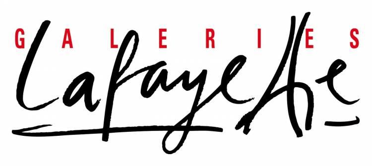
The two 't's of 'Lafayette look oddly crooked until you realize what they're supposed to represent. Nothing in Paris is considered to be more iconic than the famous Eiffel Tower, and that's what the 't's are based on. The crossing of the 't's is the central support strut of the tower. We don't know why the tower seems to be leaning - that's really more of a Pisa thing - but it's a lovely nod to the company's heritage.
Until very recently, the advertising slogan of Gillette was 'the best a man can get.' For the sake of impartiality, we'll point out that other grooming brands are available, but there's no denying that Gillette is one of the most widely-recognized names within their sphere of industry. When you think shaving, you tend to think of Gillette. That's exactly what Gillette wants you to think, though, and they've made sure of it by incorporating a clever little feature in their design.
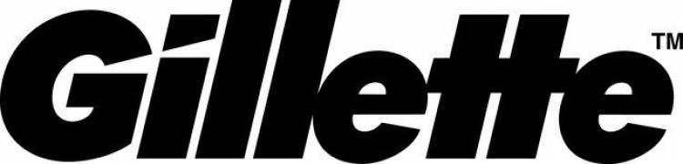
The Gillette logo looks bold and plain - and it is - but there's one little bit of flair happening within the first two letters. Look at the way that the opening of the 'G' seems to come out and slice off the top of the 'i' at an angle. It's like the word itself is so sharp that it's cutting the letters being used to spell it, and reminds you that Gillette razors are sharp and powerful. It's minimalism done well.
The Milwaukee Brewers don't use this logo anymore, and we have no idea why. If teams won tournaments and competition on the strength of their logos, the Brewers would have been picking up World Series wins regularly during the years they wore this logo on their jerseys. It was replaced in 1993 by something far less interesting, and we wish they'd rip that newer logo up and go back to this classic.
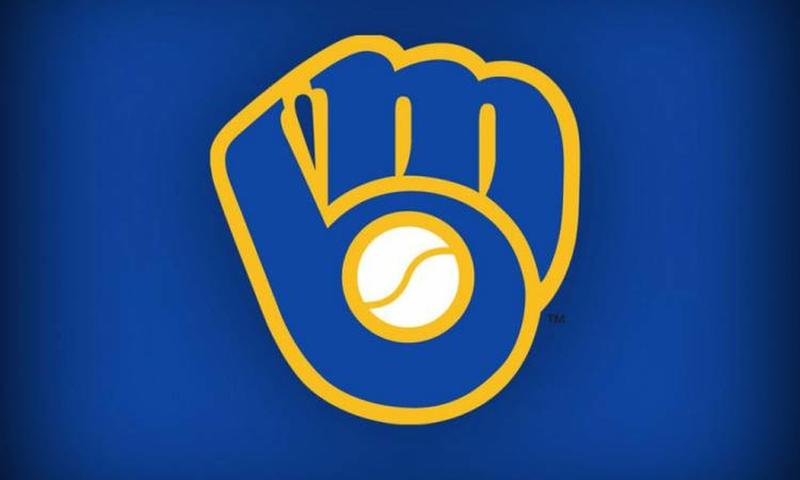
Everything about this logo is perfect for a baseball team. It's a mitt holding onto a ball, and yet the knuckles of the catcher running along the top of the mitt are a letter 'm.' The rest of the mitt then becomes a 'b.' The whole logo looks like it's giving you a fist bump, and it's brilliant. If you had something like this to advertise your team with, why would you ever tamper with it?
Quiksilver is the single biggest name when it comes to clothing for surf or snowboarding. A few years ago, they became so popular that people who'd never taken part in either activity were wearing their clothes, just because they looked so cool. They're not quite as a la mode now as they were in the 1990s, but they're still dominant within their industry.
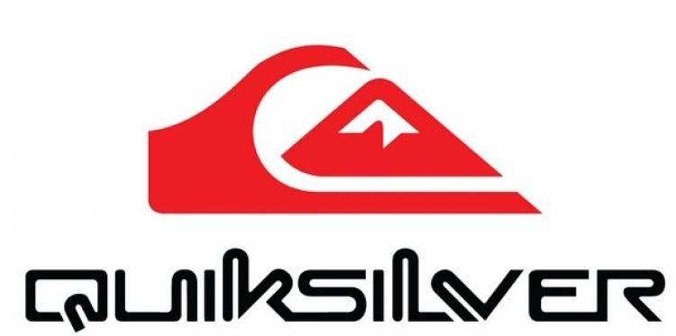
Their instantly-recognizable logo is based on a famous work of art - a Japanese woodblock printing called 'The Great Wave off Kanagawa,' which depicts a mighty wave which would be perfect for a keen and skilled surfboarder. They've adapted the image a little to make it look a little bit like a crash helmet - which no snowboarder should ever be without - and so it's a dual-purpose logo that suits their product range perfectly. It's a high-fashion logo for a high-fashion brand.
Specializing in clothing for females, and younger females in particular, Roxy might be best thought of as a slightly cooler and more acutely-focused competitor for Quiksilver. If you thought that, though, you'd be wrong. Roxy isn't any competition for Quiksilver at all - they're owned by the larger firm. You might not get that from the brand's name alone, but you should be able to pick up on it by looking at the logo.
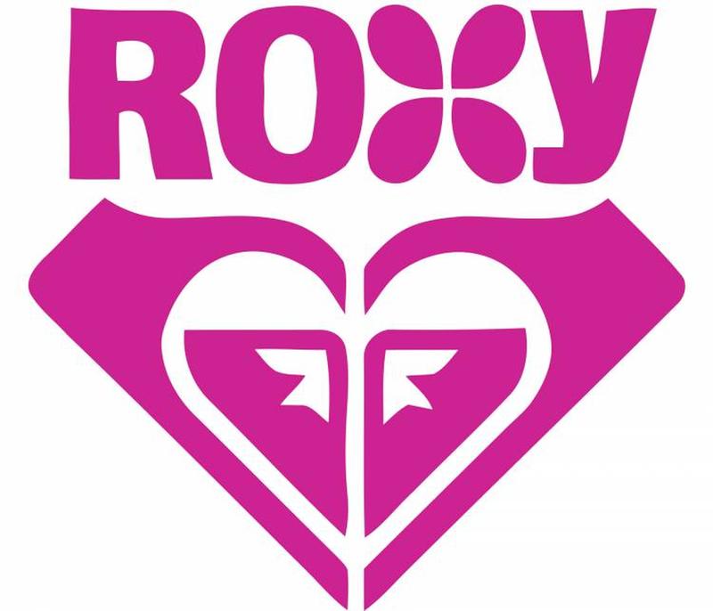
Beneath the stylized spelling of the word 'Roxy,' - which has a four-leaf clover element to it as a nice touch - we find what appears to be a love heart. You're free to interpret it that way if you wish, but it's actually just the Quiksilver logo mirrored, duplicated, and then pushed together to give the impression of a heart. We don't know whether this should be considered clever use of an existing design, or just laziness on the part of the designer.
If we asked you who had one of the coolest, cleverest logo designs out there, we imagine you'd get a long way down a list of potential guesses before you arrived at the London Symphony Orchestra. Orchestras definitely sound incredible when they're in full flow, but they tend to be thought of as part of an old-world tradition instead of cool and cutting edge. Despite everything we've just said, take a look at that beautiful logo!
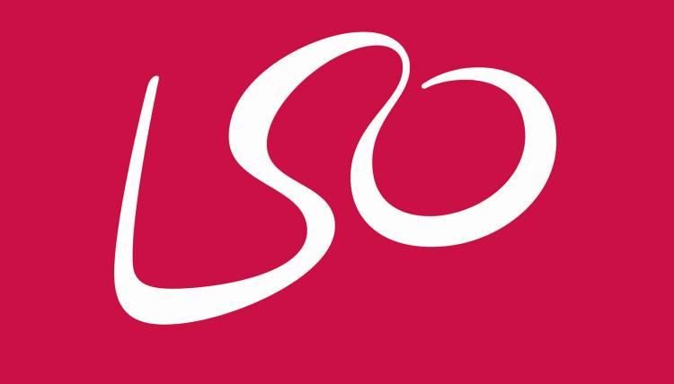
If all you can see are the letters which spell out the initials of the orchestra, you're not trying hard enough. Try again, and this time imagine the curve where the 's' meets the 'o' as the head of an individual. That would make the 'l' and the rest of the 'o' arms - and suddenly we have the outline of a conductor, standing at the front of the orchestra and directing them. It's so simple, and yet so beautiful - just like their music.
We think most people can see what electronics firm LG is doing with their logo - what we're less clear on is why. They've incorporated both the letters of their name into their logo, but then correctly assumed that a logo made up of nothing more than letters would be boring, so they've added a few more details. To the majority of people who look at the LG logo, it's a winking face, looking back at them. Given the strange arrangement of the facial features, it could almost be a Picasso.

We'd like to offer you a different take on this logo. Imagine if the 'g' was tilted about45 degrees to the right. Suddenly it's not a face looking straight-on at us at all - it's 1980s video gaming legend Pac Man. Pac Man makes a great logo for an electronics company, although it would make a little more sense of LG were involved in making video games. We may never know why they went for this logo design, but it's memorable.
You're a company who designs fonts. You've decided to go with an animal-based pun as your business name. When the time comes to design a logo to go with your new business, you've really only given yourself one way to go with it - you have to bring the two elements of your name together in perfect harmony. Thankfully, Elefont has managed to pull off the trick effortlessly.
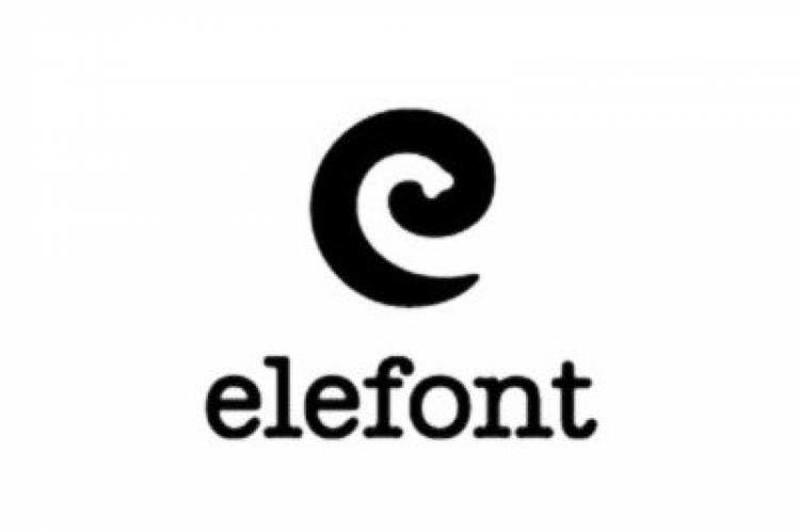
As a starting point, the slightly inky design makes us think of ink splattered against a sheet of A4 paper by a typewriter, and so it's perfect for a company who works in this field. Secondly, look at the white space within the stylized 'e' which has been put to use as their logo. It's been carefully contoured to take on the appearance of an elephant's trunk. That tells us that this design company is creative - and that's exactly the feeling we should be getting from a design company!
2018 Stanley Cup winners the Washington Capitals couldn't have a logo that looked any more patriotic. If it were possible for a logo to come with sound effects, this one would be screaming a passionate rendition of the Star-Spangled Banner directly into your face, while thumbing its own chest with passion. There's nothing more American (with the possible exception of apple pie) than a bald eagle, and here we have a bald eagle spreading its wings in the shape of a letter 'W' to symbolize the team's name.
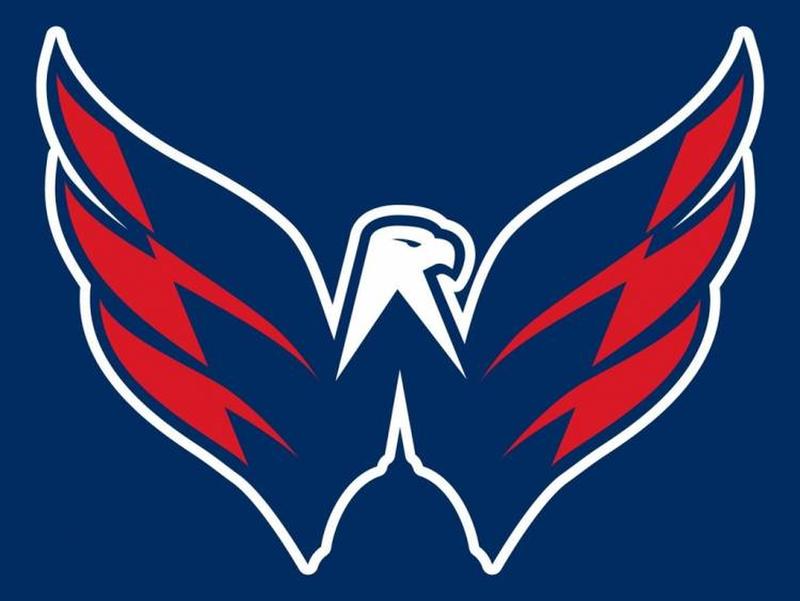
The smartest part of this design is happening right at the bottom. To give the 'W' its shape, we have some white space - and one quick glance at it should be enough for you to recognize that you're looking at the Washington Monument. Throw in the fact that everything on offer here is red, white, and blue, and this might be the most patriotic logo in all of American team sports!
Cisco might be a world leader when it comes to internet networking, but based on their logo design we'd have to say they're also a world leader when it comes to subtle brilliance in the marketing department. This seemingly-simple design not only symbolizes what the good people at Cisco do for a living, but also pays tribute to their origins. Cisco is named in honor of the city where they first set up base, and still have their headquarters - San Francisco, California.
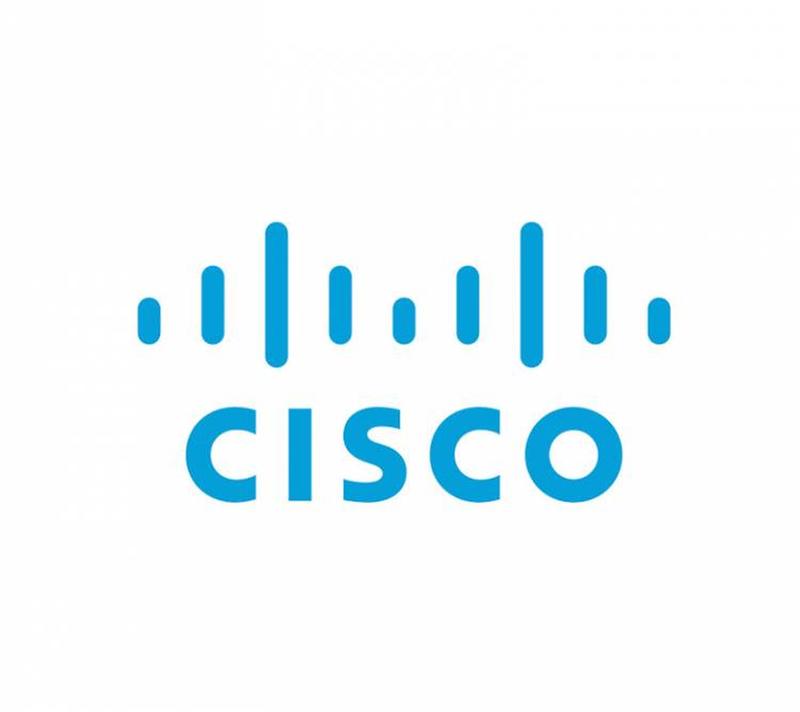
The pattern of the blue stripes above Cisco's name should look very familiar to you - and even more so if you work within a scientific or engineering profession. This is what an electromagnet looks like, and so it's a great design to go for if you work in networking. Not only that, though, but the lines are also composed in the same pattern as the construction of San Francisco's Golden Gate bridge. We suppose they could have made it red to make it more obvious, but then the subtlety would be lost.
The first thing we're supposed to think of when we see the Picasa logo is Google. Picasa started out life as Google's own in-house (and frequently inefficient and frustrating) photo storage system, and so the color scheme is borrowed from the company they took their roots from. There are two other aspects of it which are well worth noting, however.
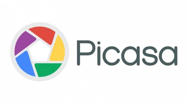
The first is the shape of the colors. Taken altogether, looking at the Picasa logo is supposed to remind you of the shutter of a camera, which is of course ideal given the software's primary function. The white space in the center, though, is meant to resemble a house. That's a play on Picasa's name. Google wanted Picasa to be the house all your photos were stored in, and 'casa' means 'house' in Spanish. It's a house for pictures, and that's what the logo tells you.
We don't know whether we should stand back and applaud the logo of South African analytics company Eighty 20 for its ingenious nature, or just shake our heads at how meaningless the logo would be to someone who didn't know what it was supposed to represent. This one is strictly for those of you who are extremely computer literate!
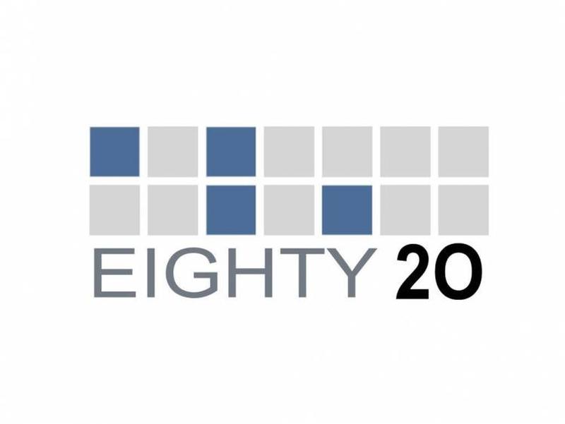
If you interpreted the blue squares in the logo as 1s, and the grey squares as zeroes, they would give you two binary patterns - 1010000, and 0010100. You can probably work out where this is going now - that's how the numbers '80' and '20' are written in binary code. It's incredibly niche, but then we suppose you'd want this kind of attention to detail if you were seeking to employ an analytics company, so perhaps it helps them attract customers. At least you could be sure that they're technically-minded!
If we were in a position to hand out prizes for the simplicity of names, we'd be offering one up right now to 'My Fonts.' The website is an online resource where, as the name implies, users can log on and help themselves to any number of fonts they want. No matter what kind of font you're looking for, it's probably available at My Fonts. The lovely squiggly logo reminds us of handwriting - the basic tool of written communication - and so it's a fine choice for a fonts company. It's doing slightly more than that, though.
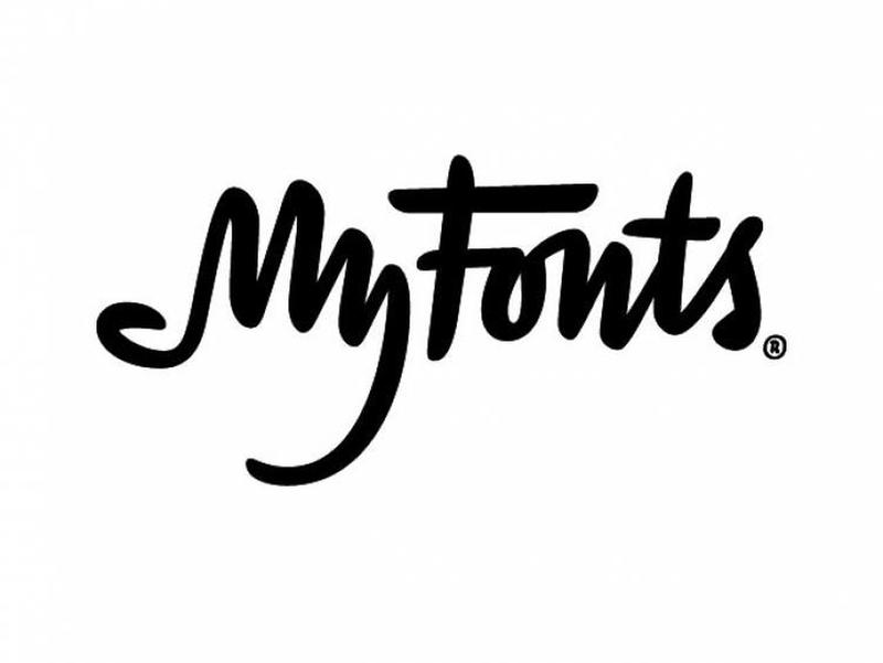
You might notice that there are a few more loops at the top of the 'm' in 'my' than strictly need to be there. That's because the word 'my' is supposed to look like a hand, coming to grab the fonts. That's what the company want you to do with their site - come in, and take away as many fonts as you wish. It's a great, playful, active logo.
If we were wearing a hat, we'd have to take it off to this one. AG Low is a construction company, and they've somehow managed to craft their name into the perfect logo for what it is that they do. The words 'AG Low' are barely legible in the design, but once you know the letters are there, you can make them out. What you're really supposed to see when you look at it, though, is the floor plan for a house.
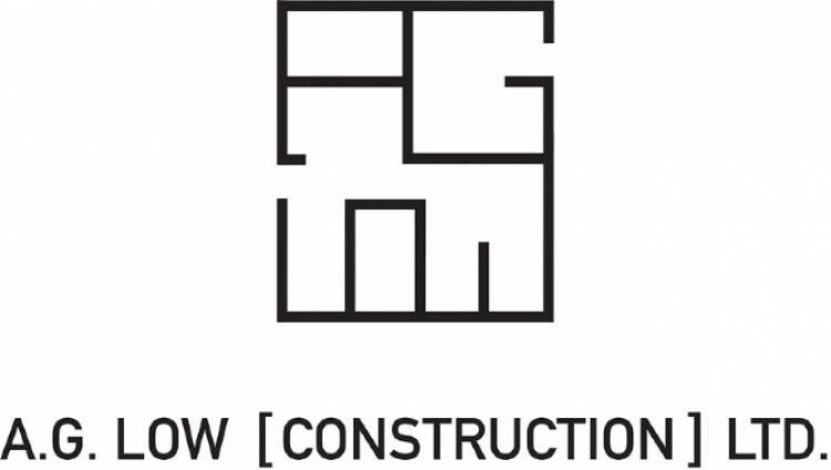
Choosing who you want to use for a construction project can't be an easy decision, but AG Low have elevated themselves above the crowd by having such a clever logo. They're telling the world that they're so good at construction that they can even make a functional-looking blueprint from the letters which make up their own name. We hope that whoever was responsible for this was suitably rewarded for their inspired idea!
We've seen a few great logo design ideas from France on this list, and the logo for clothing company New Man is right up there with the best of them. It might not initially appear to be all that inspired - it's a nice, modern choice of font, but you might be inclined to think that's all there is to it. Only when you turn the logo upside down do you realize what New Man has managed to pull off here.
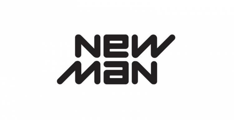
Flip the New Man logo on its head, and it will read exactly the same as when you're looking at it the right way up. This implies that the company is dynamic, and it's intended to reference the duality of much of their clothing range. New Man makes clothing for a range of different purposes, and so they wanted a logo that was as adaptable as they believe their products are. We think they've achieved that aim.
There isn't exactly a shortage in the number of companies out there who are active within the field of web solutions, or digital marketing. There are thousands of businesses involved in the industry, and standing out within a field that's so heavily populated can't be easy. Having a great logo is an absolute must if you're even going to stand a fighting chance of survival - so it's a good thing for Green Labs that they struck gold.
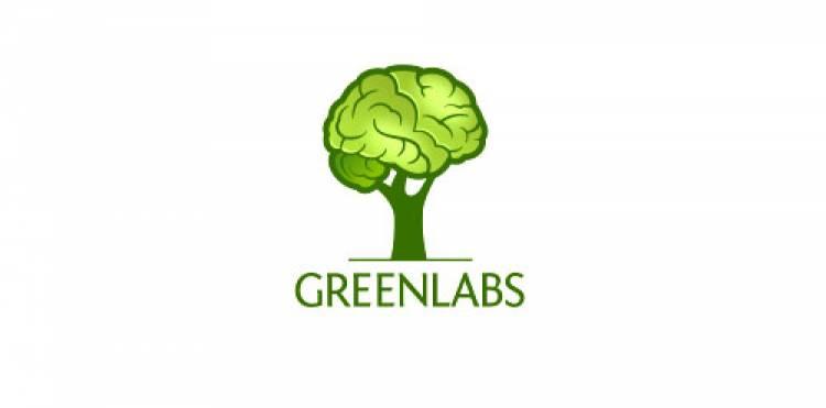
The word 'green' implies a company that's ethical and environmentally friendly, and that's summed up perfectly by the tree-based design they've opted for. This isn't just a tree though - look at the branches and leaves, and you'll see that it's actually a human brain, perched on top of the tree. The logo is telling you that this is a company with brains, ethics, and great design ideas - which is precisely what you'd want if you were looking for someone to help you out with marketing.
We might be a little bit biased about this logo, but only because the Nintendo Gamecube was such a great console. It was released during an era when the Sony PlayStation had started to eat into Nintendo's share of the market, but it was a strong performer with some great games, and it arguably never got the recognition it deserved. Nor did its fantastic logo, which is one of Nintendo's best.
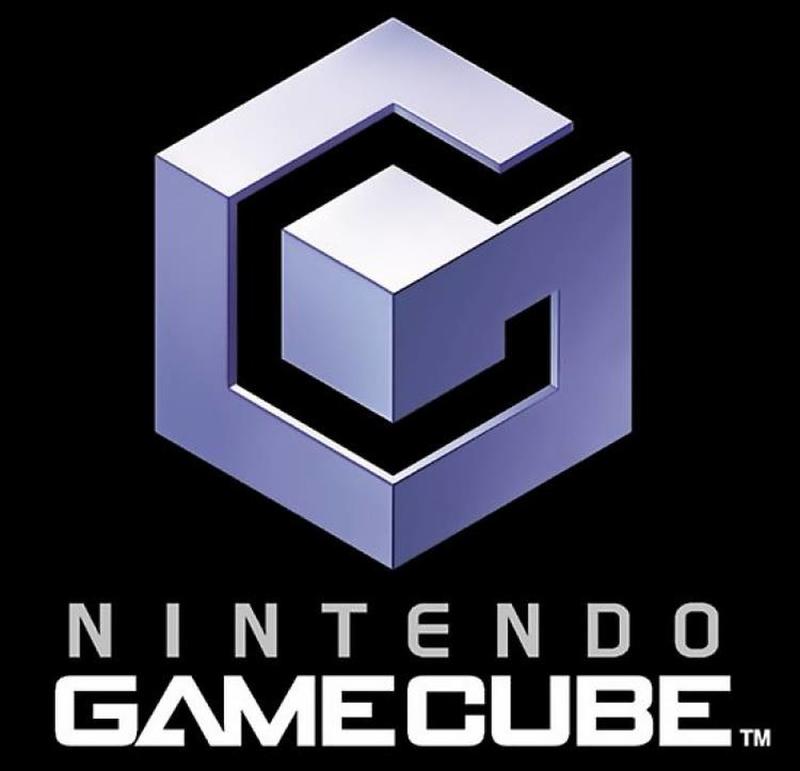
The logo is essentially a cube inside a cube, and bears a strong resemblance to the device it was designed to market. The geometrically pleasing logo has more flair to it than that though - the harder outline of the cube makes the shape of a 'G,' and within it, the white space takes on the form of a 'C.' It's spelling out the initials of the platform for you, and using three dimensions to do it with. Very clever!
Everything about Yoga is supposed to be relaxing. You almost don't expect to see a genuinely great, cutting edge logo design from a yoga company, because it would feel like too much effort. People who are drawn to yoga participate in the activity because they want to chill out, and take their mind off 21st-century distractions like marketing and innovation. We guess they just do things a little differently in Australia.
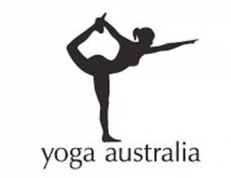
If you're someone who can easily identify a country just from the shape of its outline, you'll have immediately recognized what Yoga Australia has been able to achieve with their logo. The image depicts a very flexible woman striking a pose which might be more closely associated with ballet than yoga, but that white space between her arm and her leg is the distinctive shape of Australia. We wonder if anyone could replicate this in real life?
What Pittsburgh Zoo has managed to accomplish with their logo is a favorite trick of psychologists. You might have heard about the Rorschach test, which is performed by showing someone a series of ink blots and asking them to describe what they can see in the ink. Pittsburgh Zoo has used the principle behind those tests to design a logo which at first appears to be a tree - until you shift your perspective and begin to concentrate on the spaces, and not the ink.
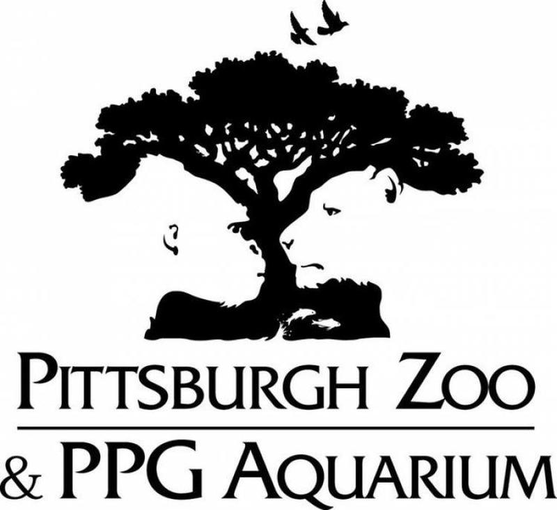
When we do that, we find that instead of seeing a tree, we're looking at a lion and a gorilla coming face to face. That's a lot more exciting than a plain old tree, and we're sure we're not the only ones who've suddenly found ourselves considering a trip to the zoo in the near future. Despite the seeming aggression in the stare-down, though, we're happy to confirm that the zoo doesn't organize fights between big cats and primates!
'Spartan' is a mighty name for a golf club. We don't really know if the ancient Greek warriors were big fans of golf, but we suspect not. We're also not sure why a club for players of a sport as genteel as golf would want to associate themselves with one of the most fearsome fighting forces in all of human history, but that's what's happened with the Spartan Golf Club, and it's given us this eye-catching design.
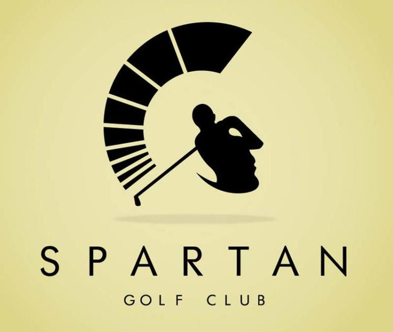
There are two ways of interpreting this logo, both of which are intentional. The first - and perhaps the more apparent- is a golf player taking a swing of his club. On the left is his marked trajectory - or, perhaps if you're a fan of golf video games, his power meter. Look at the outline another way, though, and that meter becomes the plumage of a spartan warrior's helmet. The silhouette of the golfer becomes the warrior's face, and the gap between the golfer's arms is his eye.
Charities shouldn't necessarily need flashy logos to attract attention. When it comes to charities, you'd hope that any just cause would attract financial backing, and so the addition of a good logo would just be a bonus. The Hope for African Children Initiative does vitally important areas in a region of the world where childhood poverty and disease are sadly a reality of life in many regions - and its logo symbolizes the hope of their mission.
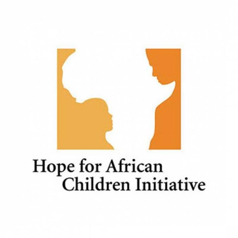
Starting off with a classy, earthy African color scheme, the majority of the space taken up by the logo is the white center, which is the outline of the African continent. On either side of it, we have human silhouettes - a child on the left, and an adult on the right. It's a logo about unity and hope, and it's a particularly strong example of design work which perfectly communicates the intentions of the company using it.
All fast food fans are familiar with the distinctive logo of Wendy's. It looks like it's barely changed since the 1950s, and for many of us, it's permanently connected to being taken to Wendy's as a treat by our parents. Maybe there's a reason we all feel like that - and it's a reason that has nothing to do with the food!
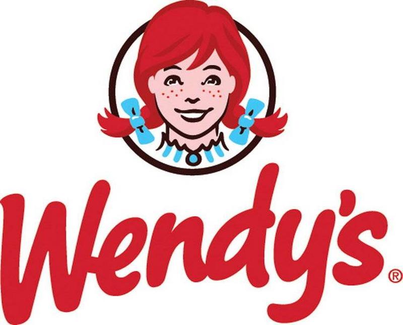
The clever little piece of extra detail in this logo is on Wendy's collar. Look below her smiling face, and you'll see that her collar appears to spell out the word 'MOM.' You might never have consciously noticed it before, but subconsciously you'll have seen it every time you've looked at the logo. If you're one of the many people who love Wendy's because it reminds you of your mom's cooking, then perhaps it's because they've been so clever about the way they've marketed themselves to you?