Football is one of the biggest American sports, which is no easy feat considering the huge followings there are for baseball, basketball, and soccer. Nothing brings people together like two teams of men smashing into each other for glory. It is easy to get wrapped up in the spectacle.
Everyone has their team when it comes to football. It is the team they can't help but root for. When it comes to picking your main team, it often has to do with where you come from: the city you were born. People tend to pick the team that they grew up with or that play for the city they currently live.
Another reason we pick the team we root for is because of their logo and colors. If your team colors aren't good, it can make it less exciting to wear their jersey. It is even worse if the team logo is bad. This artist has redesigned some crazy new helmets for 32 teams. You be the judge if they are an improvement or not.
The Kansas City Chiefs are one of those football teams who have a name that can often stir up some controversy. That is because their name references Native Americans, which many Native Americans and advocacy groups think is a way to tokenize Native Americans instead of accepting them as no different than any other ethnic group. That type of controversy can make it difficult to design an acceptable helmet.

These simple, yet refined helmet ideas would make anyone on either side of the name argument happy. They range from classy to cool. Three of them still opt for the arrowhead icon, which some more sensitive people might find offense with, but how can you deny how cool the gold outlined arrowhead looks? Then again, the giant K and C in the bottom right design stands out and makes a big statement.
The Rams have been on a journey in recent years from being the St. Louis Rams to the Los Angeles Rams. I always find it weird when a team changes territories. It makes the whole territory thing seem a little useless, doesn't it? You spend all your time rooting for a team, and then they just up and leave. It doesn't seem fair.

The horn design on the helmets make for a very striking visual. No other animal has spiraling horns like that, so it is unmistakable. The top right design really pops because of the mix of gold on the textured background. The bottom left design achieves the same striking imagery by using a white background. That being said, I can really get behind including the ram's face as well. The design is just fierce enough to work.
The Tampa Bay Buccaneers already have a pretty intense helmet design, especially compared to teams like the Greenbay Packers and the 49ers. I mean, a skull and crossbones hits a little harder than a G or a 49, no offense to either team. There is something visually striking about the menacing skull, although that also means it can come across as a little childish.

These new designs really lean into the skull design, making it even more prominent in some cases. The giant skull in the bottom right might be easy to see from the stands in a stadium, but that's a pretty big cartoon skull. The bottom right strikes a good balance between the cartoonish skull and a more refined design. Ultimately, I'm not sure the candle apple sheen of the top right design is the right look for a football team.
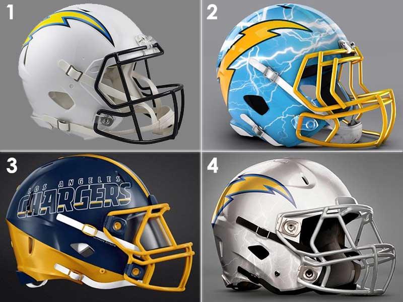
These redesigns for the Los Angeles Chargers are sooo LA. When we think of LA, we think about all the glitz, glam, and ostentatious people. These designs definitely can be described as ostentatious. The Chargers' usual design is a little too plain, using a white backdrop to place the lightning logo. These new designs go a little too crazy though.

The top right design is out of this world. It looks like the people from Pimp My Ride took over that design. The bottom left design is almost classy, but it is a little too hard to read and could easily be mistaken for another team with similar colors. The bottom right just adds some simple changes like changing white to silver and adding a faint hint of lightning bolts. It might be the best way to go.
The Jacksonville Jaguars aren't known for being the best team. Not historically, at least. Given that their mascot is such a fierce animal, that is surprising. Not that the mascot ever makes the team. These designs prominently feature the fierce feline, especially the top right design. This design is very cool, but it looks like something the mascot should be wearing, not the players.

The bottom left design is like the top right in many ways, except it is a little more subdued by adding the color at the bottom. The bottom right is the best option in my opinion. The logo is a good size, and the rest of the color pattern evokes the jaguar without being overly gaudy. I could see those helmets looking good from a distance and up close and personal.
The Browns current helmet is a bizarre one because it is so old school that it circles back to modern. Think about it. What's more modern than stripping everything away and just focusing on the team colors? I could see a team doing a radical shift backwards like that, but in this case, the Browns need to update in a radical way AWAY from the single color design. The top right design is far too similar to what they already have. The key to a redesign is in the bottom two.

The bottom left helps people realize what exactly a Brown is - a dog? It is a cool design, but I think it is a little too similar to a cartoony design a child might wear. The bottom right, however, is a great marriage of the old design with new concepts.
The Cardinal's current design is fairly stock. One plain color with the logo featured in a medium size. It's not bad, but there's a lot of room for creative improvement. The artist's designs are mainly just resizings of the cardinal logo, but that's not a bad thing, even if it is the most direct creative route.

The top right and the bottom left take two different approaches to the giant sized cardinal head. I tend to like that type of design when the mascot's eyes are big and prominent like they are here. The bottom right is likely to attract more old school fans since it is similar to the old logo with some added features, like the split color top and bottom. The silver is a nice touch as well, but in this case, these new designs make the old one look good.
The Lions are an extremely lucky football team. What team wouldn't want a lion as their mascot? It is arguably one of the coolest mascots. Part of what makes the Detroit Lions so cool is their classical take on the lion. It is designed more like a sigil than a photorealistic lion, like something a knight would wear. I am glad the artist decided to keep the integrity of that design.

That being said, these designs are overall far too tame to be very indistinguishable from each other. The top right is essentially just the class helmet but with some color changes. The same is true for the bottom right as well. The bottom left seems to be the most radical shift in design, but that is solely because of the lion logo being larger.
The Panthers are working with a really cool color scheme, which is why it is such a shame they use so much grey in their helmet design. I am glad these other designs feature the other colors much more prominently. The top right definitely takes advantage of the blue color incorporated in the team's colors. It is bright and flashy, if that is what the team is going for. Otherwise, the bottom right design is fairly strong. It keeps the grey background color, but with the jaguar logo being bigger, there is a lot more color to the design.

The bottom left design proves just how striking baby blue on black can be. It is a very cool design that features the jaguar logo in a very unique way. Only a few lines are needed to create the design from the black.
The Bengals current helmet design is an interesting one. It is tiger striped, which should generally look pretty cool, but it feels a little too childish or cartoonish due to the size of the stripes and their lack of sharpness. The design on the top right fixes this by adding sharper lines to the tiger stripes and also adding two tiger eyes on the helmet. The tiger eyes are a little too detailed, making them a little unclear though.

The bottom left design is a little too artistic for its own good. It might make a good poster, but when viewed from up high in the stands, it will just look like a jumbled mess. The bottom right is the most modern design, using big block colors with just a little bit of design used sparingly.
I have always found the mascot for the Oakland Raiders to be very interesting. It is basically just a football player. That is like being called the Oakland Football Players. Ok, so maybe it isn't that stupid, but it is still an odd logo. Being so odd is what also makes it so iconic. Like it or not, once you see black and grey, you can't help but think of the raiders. Their normal helmet is a little too classic though.

The top right is exactly the type of modern design I would expect to work well in the NFL in this era. It has the big logo with a carbon fiber background, looking very sleek. The bottom right has some great ideas, but the texturing is a little too much. It makes the helmet appear dirty.
The Bills original helmet is prominently white, which can do a lot of good for a design since it makes the logo pop incredibly well. That being said, the color scheme also makes it a little confusing with other teams. From afar it can be confused with the Patriots helmet to the uncanny eye. The design on the top right uses the red to differentiate itself very well.

The bottom right design adds a few more lines of color at the bottom that set it apart, but I don't think the silver main color does it any favors. The shining star is the bottom left, which uses negative space by eliminating the buffalo entirely. It is a bold move but it makes for a very interesting design. Ultimately though, it sacrifices clarity for an interesting design.
I have to admit, the Ravens' mascot logo is very cool looking. That is one mean bird, isn't it? Put that raven up against a cardinal, and I think we all know who would win, regardless of who might win on the actual field. The top right design uses a matte finish, which is very hip and modern these days, but it is a little too similar to the usual helmet.

The two bottom examples are very drastic design choices that forego the mascot logo entirely. The bottom right logo simply uses the Baltimore B, though I don't think that is going to become iconic anytime soon. The bottom left isn't so bad, using an abstract feather design, but I think it would lead most people to miss the old logo. That Raven logo is just too good.
The Houston Texans helmet screams Texas pride. In fact, all of these redesigns scream Texas pride. I guess that's a must when your mascot is literally a Texan. The usual design is your classic logo on flat color, so it can use some updating. The top right design is a little too big to make out all the independent pieces, so it comes across less like Texas and more like generic America.

The bottom right is a showstopper. It adds the outline of the state of Texas, making it clear that this is a Texas team. It would be my first choice, though the bottom left isn't bad either. The use of clear, prominent colors really makes the design pop, though sometimes using two prominent colors equally like that can make the design look a little jumbled.
You can see from the Titans colorful logo that they have a lot of colors to work with when designing a helmet. The mix of white, red, and two blues makes for a striking logo, and a lot of color to play with. All of these designs make really interesting use of the color scheme and logo. The giant sword in the top right is visually striking. No one is going to have a hard time making that out from the crowd.

The bottom left is straight up funky. I appreciate the bold design, but it doesn't properly evoke the Titans. The bottom right design is a good alternative to the top right, depending on which color you like featured more prominently. White background can help objects stand out a little more, which is what the background does for the sword.
I have to admit. The Vikings current helmet is pretty awesome. The dazzling purple background is a showstopper, and the viking horns are a no brainer. My only issue with it is that the viking horns are just a tad too big. Some of the redesigns really fix this issue, like the top right and bottom right especially. Their horns are just a tad bit smaller which really helps for clarity. The top right has a top half that is gold, evoking a vikings hair, which is an especially nice touch.

I'm also a big fan of the bottom left which is a little more of a modern approach to the design, using stencil-like images instead of cartoon depictions of the horn. That being said, why go subtle when you are dealing with a viking?
The jets are an odd team to make a logo or a helmet for. What exactly is a jet? How do you show that clearly in a symbol? Historically, the jets have opted to go for text as their logo, just like the 49ers. The top right design is pretty radical, and I'm not even sure if it's regulation with that windshield across the eye-hole. It looks like something the military should be wearing, not football players.

The two bottom designs look fairly classical, although the bottom left design looks like something the minor league Jets would wear for some reason. The bottom right design looks to fit the most with the way the NFL is updating uniforms and logos while still keeping the relatively classic look. The glossy sheen does just enough to update it in a really cool way.
There isn't all that much that is intimidating about the Dolphins, unless you're a shark. Luckily at least one of these designs somehow makes the dolphin look intimidating. The bottom right features a larger dolphin figure, which might be the best design out of all of them. The top right gives me a little too much of Bronco vibes due to the deep orange. The bottom right looks a lot like the original helmet, except with some added frills like wavy color lines.

The Dolphins hold a great place in my heart because of their inclusion in the film, Ace Ventura, Pet Detective. It was the Dolphin's mascot who was kidnapped. I won't spoil it for you, but the movie has a climactic reveal of who kidnapped the Dolphin, but it's not for the faint of heart.
I will be honest. I'm not a big fan of the seahawks color scheme. The neon greenish color is a little too much. It looks like something out of a sci-fi movie, not something out of respected sports. What is a seahawk anyway? Any time you add “sea” to an animal, it immediately makes it less cool. Lion. Sea lion. See what I mean?

The top right design looks good, but it doesn't feature enough of the beak to make the bird design clear. The bottom left is incredibly green due to the face guard, but I actually like that. If you're going to put green anywhere, put it on the face guard sparingly. The seahawk logo is also very clear in this design. The best is the bottom right which uses a classic logo with a textured background. The textured background does just enough to modernize it.
Generally, when your mascot is a bird, it allows for a lot of cool design options. That is especially true when compared to something like a… squirrel. Luckily, there are no squirrel mascots in football yet. That could all change when the Chiefs are finally forced to change their name. These Falcons helmets make great use of the falcon mascot.

The top right design is very striking with its use of the wings. The color scheme for the wings makes them pop. Then the simple design of the bottom left is a great choice as well. There is no mistaking which team would be wearing those helmets, which is a big consideration to make when designing a helmet. You want fans to be able to spot the team right away, without having to second guess.
The Colts have a lot of luck on their side. How, yo uask? That's because they have a lucky horseshoe as their logo, and even their quarterback is named Luck. The horseshoe logo is an iconic symbol, so I am glad it is still featured so prominently in these designs. Each one of them takes a similar size for the horseshoe logo.

The bottom right design almost looks good, but the checkered design is a big mistake. It doesn't feel thematically appropriate, nor does it look all that great on a circular surface. The bottom left, however, is a strong design. The carbon fiber style of texture makes it look very futuristic. Carbon fiber texture is a sure-fire way to make a design pop. The top right takes on a more classic approach, while adding some gloss to update it.
The Redskins are among the most controversial teams in the NFL due to their name, even more controversial than the Chiefs. No matter where you stand on the team name debate, it is pretty clear that their current helmets feel like something out of the 1950s. The design on the top right isn't bad, but it won't do any favors to quell the controversy since a Native American is featured prominently on the design. If the name doesn't change, at least that logo has to go.

The bottom two designs are likely the best choices for making everyone happy while still maintaining the name and style of the team. The bottom left has a classic art style, much like the original logo, while the bottom right is much more modern. The oversized feathers wrapping around the helmet add a nice touch as well.
The New Orleans Saints have a prominent logo that doesn't have much room to play with the way an animal logo does. It is not as if you can make the helmet look like the Saint logo the way you can make a helmet look like an actual tiger. That being said, the artist has chosen some classy routes for these designs. The top right uses a glossy look to modernize the design. Sometimes that's all a helmet needs.

The bottom left uses an oversized logo, which I think only works with certain logos. This is not one of those logos. The bottom right adds some nice touches with the vertical lines. Sometimes adding unnecessary lines can make the helmet too busy, but in this case it works really well. The lines help frame the logo.
The San Francisco 49ers are one of those teams with a strange name. If you don't know your history, the 49ers sounds like one of the weirdest names for a football team. The name refers to the gold rushers in 1849 who rushed to California in search of gold. It is a reminder of an important part of California's history, hence the gold color that is so important to the team's colors.

The two designs on the right side really push the gold design for the team, which is an awesome direction to go. The 49ers are all about gold, so the more we can see that in their design, the better. That being said, the helmet design in the bottom right lacks gold, but the deep red is visually striking, if not a little boring.
What do football fans and Saturday Night Live fans have in common? They both love THE BEARS! I'm of course referring to the iconic Saturday Night Live Sketch where a group of Bears fans sit around a table waxing poetic about the bears. These new helmet designs help bring the Bears into the new millenium. The top right design is incredibly interesting how it puts the C logo on the very front of the helmet so that it can include claw scratches. You got to love that kind of thinking outside the box.

The two bottom designs use the other team colors in a really interesting way. The bottom left design includes a little too much of the orange, but the bottom right uses it in just the right, classy way. It is one of those designs that achieves both a futuristic and a classic took.
Some teams have the lucky bonus of naturally having colors that go well together. Dark blue and orange is a great color combination that generally works no matter how much blue or how much orange you use. Those colors mixed with the awesome bronco logo make for a lot of interesting combinations that work well. These designs don't shy away from using the bronco logo.

The top right includes the rocky mountains, which is great for a painting, but might be a little too busy for a football helmet. In my opinion, the bottom left design uses the best mix of blue and orange, along with a large bronco logo. The people in the nosebleed seats won't have a problem seeing the logo.
Greenbay's iconic G is an instant way to recognize the team. They are one of the few teams that simply have a letter for their logo. It makes you wonder, what exactly is a Packer anyway? I'm not even sure what their logo would be other than a G! The simple and classy helmet design is solid, but these other designs get a little more funky and even a little silly. Wisconsin might be a big cheese state, but I don't know how necessary cheese is on the helmet. Then again, some fans wear giant cheese hats to support the team, so maybe that one works!

The digital camo design is a nice, modern twist. Digital camo has been adopted by the military in the last couple of decades, so it helps give the helmet a futuristic, battle-ready look. If there is anything similar to going into battle, it is football.
The Pittsburgh Steelers helmet is one of the most classic looking helmets in the NFL. The simple, small circle logo with the three diamonds and small Steelers text just looks like classic Americana football. Even the simple black color evokes the feelings of good versus bad, back when it was red team versus black team, or white team versus blue team. It harkens back to a simpler time.

That being said, that only means that it is time for an upgrade. Classic is great, but change is good too. The bottom left design with the three giant diamonds still feels like classic Steelers, but the large size of the diamonds gives it that extra pop, like it is the classic logo evolved. The scratched-out top right design is very radical and would definitely set the team apart from other NFL teams.
These New York Giants helmet designs have some very interesting elements to each of them. Starting with the top right… look at all that American pride. The helmet is practically an entire flag. While that may be bold - and it may please the most patriotic of fans - a design so heavy with American imagery should be reserved for a team like the Patriots, not the New York Giants.

The two bottom designs use the New York skyline in a really interesting way. They both take the same basic concept but execute it in a different way. The bottom left is a bit more classical with its clear lines, while the bottom right takes a more modern look by blending the buildings into the helmet slightly. Smartly, the designer kept the same NY font for every design.
The artist really provided a diverse array of designs for the Philadelphia Eagles, each with their own stand-out aspects of the design. With an eagle, you can either go with the face or the wings. Both are pretty awesome on a helmet. The top right design adds some feather texture throughout the helmet, along with the wings on the side. The texturing might be a little too much though.

The bottom right design is a better version of the wing design. The wings are sleek and simple, without any texture to distract. Ultimately though, I love the eagle face on the helmet. When you have something as cool as an Eagle's face, you might as well use it. It is also pretty cool how the beak is cut off right where the helmet's face opening is placed.
Patriots have become the team to beat over the last decade. They just can't help but win Superbowls. That's' why when they don't make it to a superbowl, it is generally more exciting because there is an earnest debate about who will win. Once the Patriots are involved, you might as well put your money on them. Their logo and helmet, however, is a little stiff. Some of these helmet designs really go bold with their direction.

The bottom left design is the biggest departure since it actually gets rid of the Patriot logo altogether, instead using harsh lines and big colors. The bottom right design seems like a good compromise between keeping the logo while still moving towards a big change. The top right is the one that misses the mark the most. It is too similar to a Dallas Cowboys style of design.
The Dallas Cowboys could be spotted from a mile away, although you might think that it was a sheriff's logo. The giant star evokes a feeling of laying down the law, which when the Dallas Cowboys are at their best, they lay down the law on the field. These helmet designs take the classic star and blow it out in different ways. The bottom right example is so insanely patriotic that it just might work for Cowboys fans. The addition of the American flag is sure to make plenty of NFL fans happy.
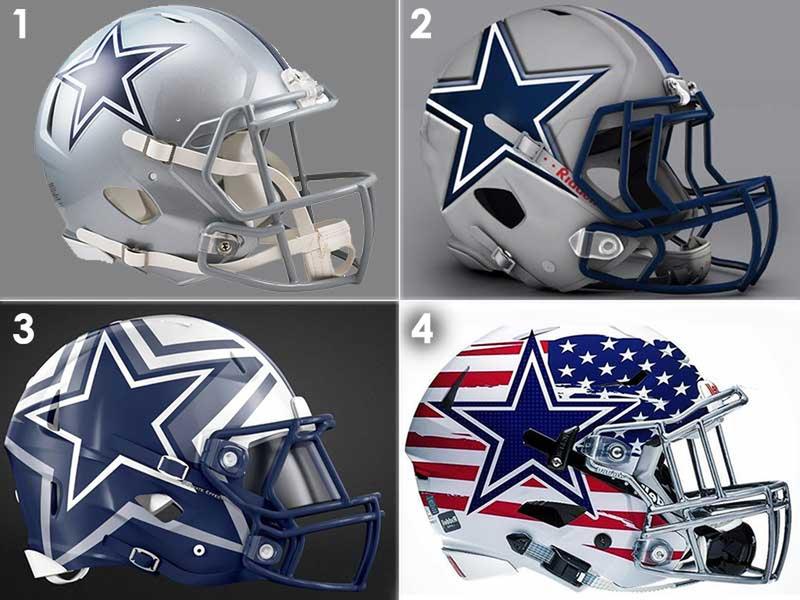
The bottom right design has the most potential for not being too flashy, yet still having a very modern look. When updating a helmet design, you want it to feel like an evolution to the current design, with the exception of the American flag design, these all do that.