We've become so brand conscious that everywhere you look; you'll see a logo of some business or the other. While you might not pay much attention to the logo other than identifying it with the brand, some logos usually have a hidden message inside them that not only ties with the brand but also sheds more light on the company's story. Not everyone seems to catch on to these tiny hints and clues but if you've got a sharp eye, you can usually catch these, like the ones below.
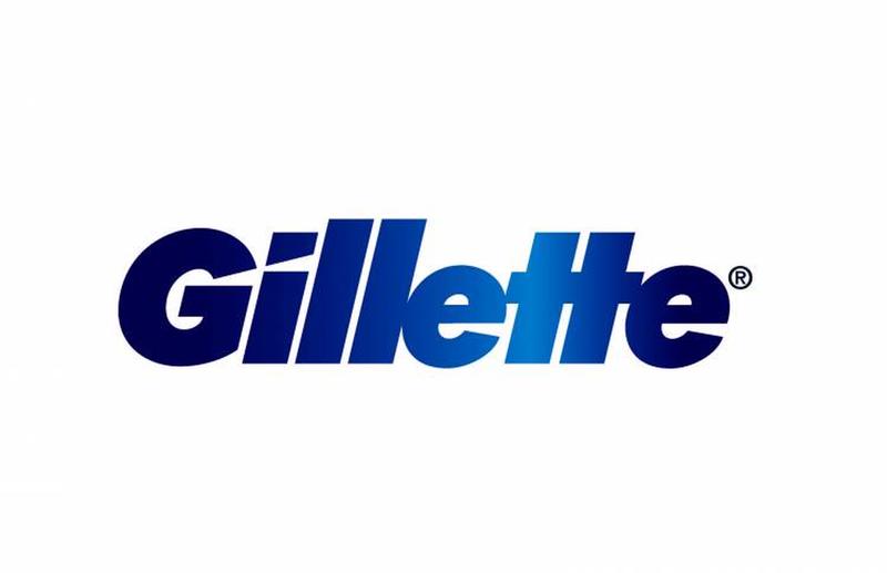
A company that's known for the precision of their shaving tools, Gillette allows their logo to reflect this aspect in a creative manner. Take a close look at the negative spaces in the font of their logo. They look like they have been cut out with great precision with a razor.
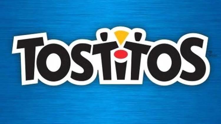
Finger food and dip are the perfect snack for a get together and Tostitos is known for their amazing dips including salsa verde. In fact, the logo is designed to show two people dipping a tortilla chip, in a bowl of salsa in the font. Once you see it, you can't unsee it.
Shipping a package? You can always FedEx if it's urgent. FedEx's logo is iconic not only for the color; the logo also makes creative of the negative space between the 'e' and the 'x'. If you look at it just right, you can see the forward arrow. Being fast and precise is in their name.

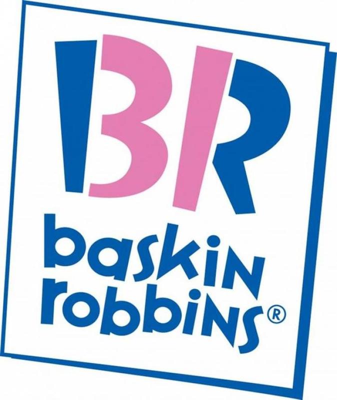
Among the largest chain of specialty ice cream shops, it feels like you can never try all the flavors of their ice creams. Luckily, you can find out just how many flavors they have by taking a closer look at their logo. The pink area in their logo says it all.
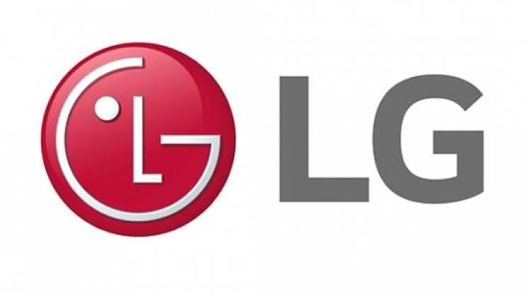
How does LG let you know that their products can bring a smile on your face? By having a logo that says they know this fact. The red circle with the L and G are placed with only one eye, making a winking face. Some fans have also stated that it looks like a Pacman.
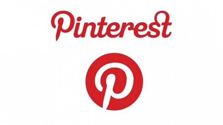
What's the favorite social media network for a person who likes DIY projects? It's Pinterest. The unique platform lets you 'pin' your favorite ideas and create a virtual pin board. Their logo also shows this aspect as the 'P' in it is shaped like a pin too.
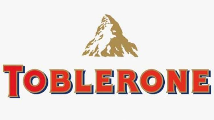
Toblerone is a Swiss chocolate bar that is a favorite across the globe. Starting out in the little town of Bern that is known for their bear population, Toblerone pays homage to this fact by including the image of a bear in their logo.
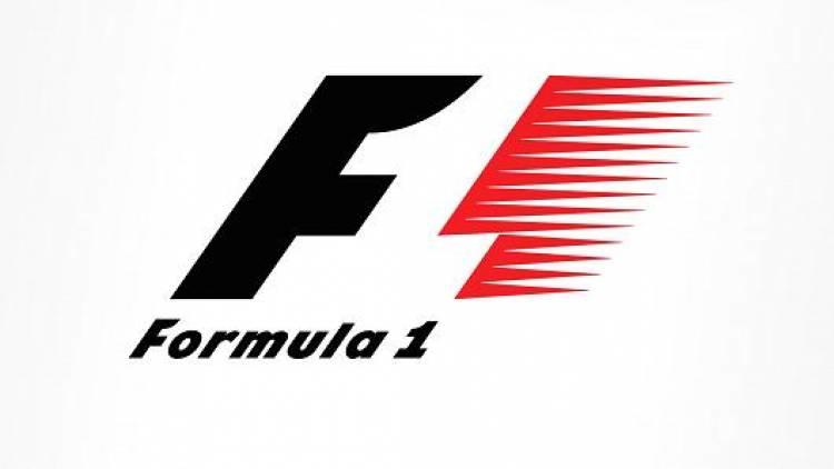
Formula One is famous for their fast track racing and their racers. Their logo imbibes the passion, speed and the overall energy that the sport has by showcasing it to perfection. It shows a clever use of negative space that shows the F1 written on it.
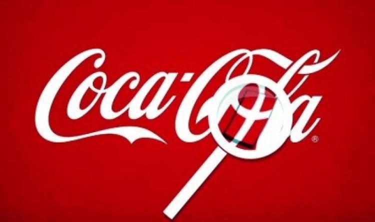
At first glance, you can't see any hidden imagery in Coco Cola's logo but the company actually has the flag of Denmark hidden in the font. While they claim this wasn't intentional, they see no problem with the association since it is the happiest country in the world.
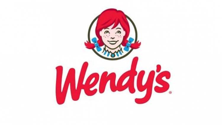
Wendy's has been making food for so long that it has made them a national treasure. Claiming that the food they produce is just like 'mom's cooking'; Wendy's logo also states this fact loud and clear. Just look closer at Wendy's collar and you'll see 'mom' in cursive font.
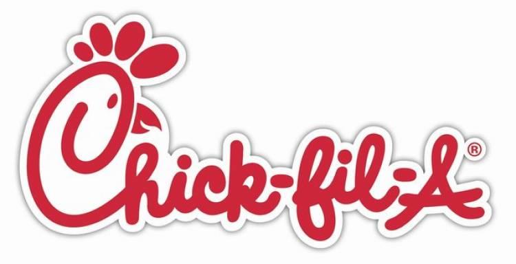
Another fast food chain that is renowned for their amazing chicken items, Chick-fil-A pays homage to their main protein by including it in their logo. The cursive font showcases the head of a rooster and it's not very hard to miss at all.
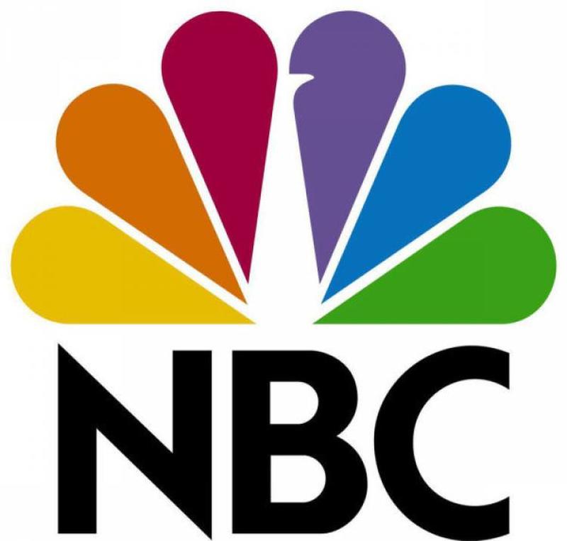
NBC is one of the biggest networks on television with various departments and they make sure to include them all in their logo. Each feather in the peacock's plumage represents a different department and the white head is meant to show that they're always moving forward.
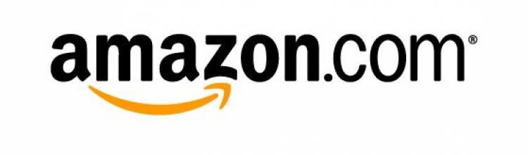
Amazon believes that they make the life of their consumer's easier by bringing smiles to their faces. In fact, if you look closely at their logo, you'll see it smiling back at you too. Moreover, some people claim it's an arrow that shows that that you're making the right choice when shopping with them.
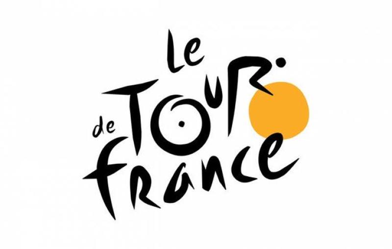
Another event that is widely loved for its thrill and speed is the Tour de France. Focusing on cycling, their logo font is cleverly spaced so that it looks like a cyclist that is speeding as quickly as possible. Focus on the 'Tour' in the font and you'll see the whole image come alive.
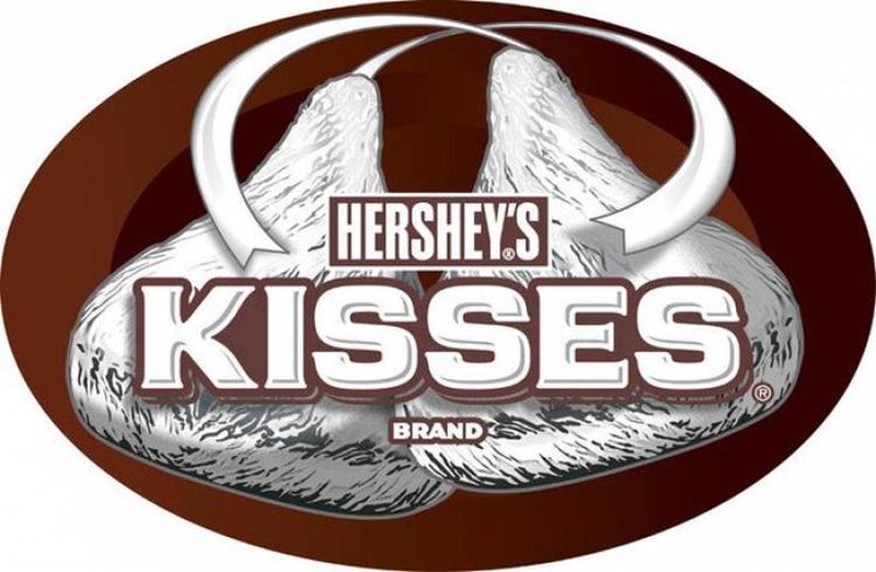
Hershey's is known for their sweet treats and their Hershey's Kisses are the most popular ones. Showing that you're always looking for one more when you're eating Hershey's Kisses, they also included one, right in the logo. Just take a closer look at the negative space in the font.