
The Milwaukee Brewers don't use this logo anymore, and we have no idea why. If teams won tournaments and competition on the strength of their logos, the Brewers would have been picking up World Series wins regularly during the years they wore this logo on their jerseys. It was replaced in 1993 by something far less interesting, and we wish they'd rip that newer logo up and go back to this classic.
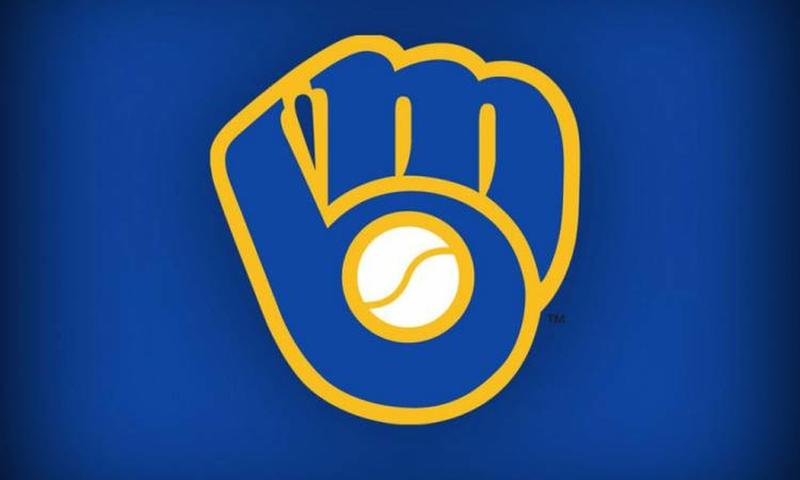
Everything about this logo is perfect for a baseball team. It's a mitt holding onto a ball, and yet the knuckles of the catcher running along the top of the mitt are a letter 'm.' The rest of the mitt then becomes a 'b.' The whole logo looks like it's giving you a fist bump, and it's brilliant. If you had something like this to advertise your team with, why would you ever tamper with it?