
We've seen a few great logo design ideas from France on this list, and the logo for clothing company New Man is right up there with the best of them. It might not initially appear to be all that inspired - it's a nice, modern choice of font, but you might be inclined to think that's all there is to it. Only when you turn the logo upside down do you realize what New Man has managed to pull off here.
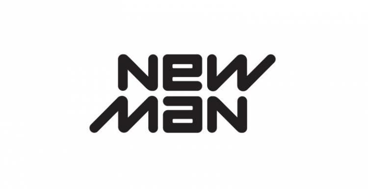
Flip the New Man logo on its head, and it will read exactly the same as when you're looking at it the right way up. This implies that the company is dynamic, and it's intended to reference the duality of much of their clothing range. New Man makes clothing for a range of different purposes, and so they wanted a logo that was as adaptable as they believe their products are. We think they've achieved that aim.