
These redesigns for the Los Angeles Chargers are sooo LA. When we think of LA, we think about all the glitz, glam, and ostentatious people. These designs definitely can be described as ostentatious. The Chargers' usual design is a little too plain, using a white backdrop to place the lightning logo. These new designs go a little too crazy though.
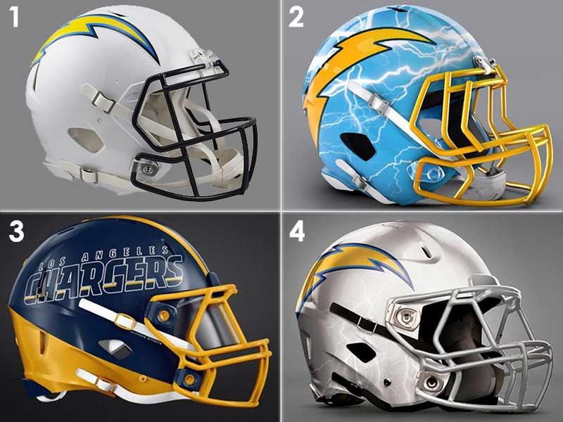
The top right design is out of this world. It looks like the people from Pimp My Ride took over that design. The bottom left design is almost classy, but it is a little too hard to read and could easily be mistaken for another team with similar colors. The bottom right just adds some simple changes like changing white to silver and adding a faint hint of lightning bolts. It might be the best way to go.